Using Color Psychology to Elevate User Experience
Many digital interfaces rely heavily on color to communicate, guide, and influence users. The right colors can evoke emotions, reinforce brand identity, and improve usability. When used intentionally, color psychology becomes a powerful tool for UX designers and marketers aiming to craft engaging, accessible, and high-performing digital experiences. Understanding how colors impact user perceptions helps in making smarter design choices that resonate on a deeper psychological level.
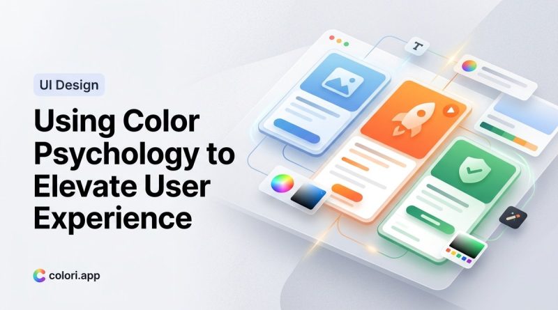
Applying color psychology in UX design influences user emotions and behaviors. Selecting appropriate colors enhances usability, builds trust, and strengthens brand recognition, leading to better engagement and satisfaction.
What is color psychology and why does it matter in UX?
Color psychology explores how different hues evoke specific emotional responses and behaviors. In UX design, these responses influence how users perceive a product, interact with it, and form lasting impressions. For example, blue often communicates trust and calm, making it popular for financial apps, while red can evoke urgency or excitement, suitable for sales and promotions.
Understanding these associations enables designers to select colors that align with the intended user experience. It’s not just about aesthetic appeal; it’s about guiding users intuitively and creating an environment that supports their needs and expectations.
How colors influence user perceptions and actions
Colors serve multiple roles in digital interfaces. They can:
- Communicate brand identity and personality
- Guide attention to key areas or calls to action
- Evoke specific emotions or moods
- Improve accessibility and readability
For instance, a bright green button may signal success or go-ahead, while a grayish tone might suggest inactivity or disablement. When colors are aligned with the content’s purpose and user expectations, they foster trust and facilitate seamless interaction.
Practical process for integrating color psychology into UX
-
Identify your core brand message and target audience
Understand what emotions and perceptions your brand aims to evoke. Are you aiming for trust, excitement, calm, or innovation? Define your primary user demographic and their cultural associations with colors. -
Research color meanings and cultural implications
Colors can carry different meanings across cultures. White symbolizes purity in some countries but mourning in others. Use resources like color psychology guides to understand these nuances. -
Develop a functional color palette
Create a palette that supports your goals. Include primary, secondary, and accent colors that reflect your brand personality and psychological impact. Ensure high contrast for readability and accessibility. -
Test and refine your color choices
Conduct usability tests focusing on color perception. Use tools to simulate color blindness and accessibility concerns. Gather user feedback to see if the colors evoke the intended emotions and actions.
Common pitfalls and how to avoid them
| Techniques | Mistakes |
|---|---|
| Using colors without considering meaning | Overloading interfaces with vibrant hues that clash or confuse users |
| Ignoring accessibility standards | Failing to check contrast ratios, making content unreadable for some users |
| Relying solely on aesthetics | Choosing colors based only on looks, ignoring psychological impact or cultural context |
| Not testing across devices and environments | Colors may appear differently depending on screens or lighting conditions |
Evoking emotions and building trust through color
Colors can foster emotional responses that influence user engagement and trust. For example, blue is often associated with professionalism and reliability, making it ideal for corporate websites. Conversely, yellow can evoke optimism but might be overwhelming if overused.
Practical tips for leveraging color psychology
- Use calm, cool colors like blue and green for finance, health, or wellness apps.
- Integrate warm colors such as red, orange, and yellow sparingly to create excitement or urgency.
- Maintain consistency across your interface to reinforce recognition and trust.
- Prioritize accessibility by selecting color combinations that are distinguishable for users with visual impairments.
“Color choices should support usability and emotional appeal simultaneously. When in doubt, test how users respond to your palette before finalizing.” — UX expert Jane Doe
How to build a color system that supports your user experience
- Define your brand personality and emotional goals
- Select core colors aligned with these goals and cultural considerations
- Establish a palette with clear roles for each color — primary, secondary, alerts, and backgrounds
- Implement and test the palette with real users for consistency and perception
Practical steps to implement color psychology in your projects
Here is a simple, step-by-step process:
- Assess your brand and audience to determine the emotional tone you want to set.
- Research cultural associations and ensure your colors fit your target demographic.
- Create a balanced palette with enough contrast to support readability and accessibility.
- Apply colors strategically to guide users toward desired actions.
- Test your design across devices, lighting conditions, and user groups.
- Refine your palette based on feedback and usability testing results.
Techniques versus mistakes in applying color psychology
| Techniques | Mistakes |
|---|---|
| Using contrasting colors for calls to action | Ignoring accessibility, resulting in poor contrast |
| Consistent color use for navigation and actions | Inconsistent coloring causing confusion |
| Color coding features based on function | Relying on color alone without labels or cues |
| Testing colors with real users | Assuming colors will evoke the same responses universally |
How to avoid common errors with color in UX
- Never assume colors have universal meanings. Always consider cultural context.
- Avoid overuse of bright or saturated colors that can cause visual fatigue.
- Don’t neglect accessibility standards. Use tools like Color Oracle to simulate color blindness.
- Keep user testing integral to your design process. Colors may look good but may not evoke the right response.
Enhancing user experience through thoughtful color choices
Colors are more than decoration. They influence perception, guide behavior, and build trust. When aligned with psychological principles, your digital products can foster stronger connections with users. Remember that subtle shifts in hue, saturation, or brightness can significantly impact emotions and actions.
Final thoughts for applying color psychology in UX
Always think about the story your colors tell. Use them intentionally to communicate your message, support usability, and respect cultural differences. Regular testing and iteration will ensure your palette remains effective. When you understand and harness the power of color psychology, your designs become more human, memorable, and impactful.
Keep color psychology at the heart of your design journey
By integrating insights about how colors influence emotions and behavior, you can craft interfaces that truly resonate. Start with your brand’s core message, research cultural nuances, develop a thoughtful palette, and test thoroughly. Small adjustments can lead to a more engaging user experience and stronger brand loyalty. Applying these principles isn’t just smart design — it’s a way to connect more authentically with your users.