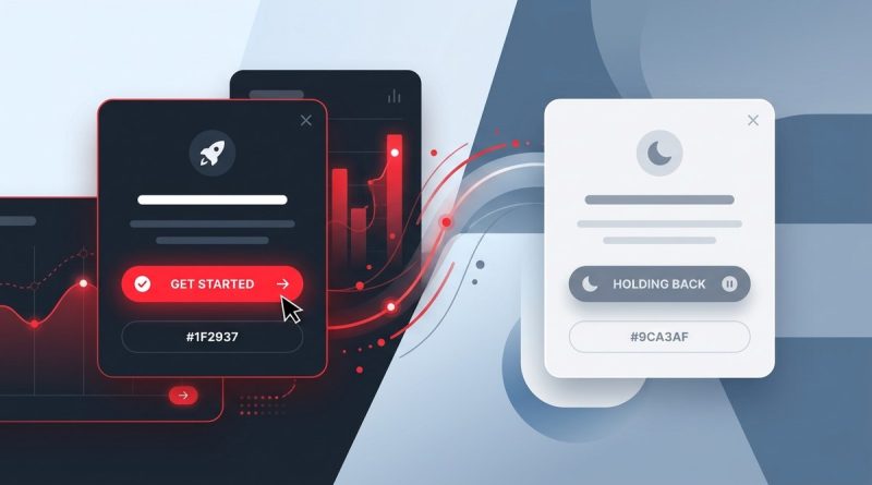
Why Your UI Needs a Dominant Red to Trigger Action (and When to Hold Back)
Your signup button is sitting there. It is a calm blue, a safe gray, maybe a muted green. Users look at it. They scroll past it. They do not click. You have tested the copy, the placement, the size. B…
Read more