Skip to content

colori.app

  • Color Theory
  • Color Palettes
  • UI Design
  • Web Design
  • Design Tools
  • UX Tips

colori.app

  • Color Theory
  • Color Palettes
  • UI Design
  • Web Design
  • Design Tools
  • UX Tips
Why Color Contrast Ratios Matter for Accessibility and Aesthetics
Color Theory
30 June 2026 noah

Why Color Contrast Ratios Matter for Accessibility and Aesthetics

When you open a website and squint to read the text against a light gray background, it’s not your eyesight. It’s the lack of color contrast. And it affects millions of users every day. Color contrast…

Read more


How to Build a Triadic Color Palette for High-Impact Web Designs
Color Theory
30 June 2026 noah

How to Build a Triadic Color Palette for High-Impact Web Designs

A website that feels flat? That’s often a sign of a timid color palette. You have three equally spaced hues on the color wheel, and suddenly your design has this electric, balanced tension. That’s the…

Read more
Are You Overlooking the Power of Tints and Shades in Your Color Palette?
Color Theory
23 June 2026 noah

Are You Overlooking the Power of Tints and Shades in Your Color Palette?

You have probably spent hours choosing the perfect base hue for a project. You found just the right blue, that ideal green, or a warm coral that felt spot on. Then you applied it to your design and so…

Read more
How to Use Monochromatic Color Schemes for Modern, Minimalist Web Design
Color Theory
21 June 2026 noah

How to Use Monochromatic Color Schemes for Modern, Minimalist Web Design

Monochromatic color schemes are having a huge moment in modern web design. They strip away visual noise and let your content breathe. When done right, a single hue can create a site that feels luxurio…

Read more
Why You Should Stop Using Black in Your UI Designs (and What to Use Instead)
Color Theory
20 June 2026 noah

Why You Should Stop Using Black in Your UI Designs (and What to Use Instead)

You open a design tool, drop in a dark background, and punch in #000000. It feels clean, safe, and bold. But that pure black might be doing more harm than good. For years, designers have debated the r…

Read more
5 Common Color Theory Myths That Are Hurting Your Web Design
Color Theory
19 June 2026 noah

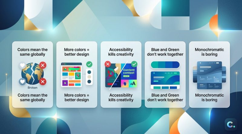
5 Common Color Theory Myths That Are Hurting Your Web Design

You have probably heard plenty of color rules. Use complementary colors for strong contrast. Stick to three colors maximum. Keep warm tones for call-to-action buttons. These rules get repeated in desi…

Read more
Why Analogous Colors Create Calming, Cohesive Interfaces
Color Theory
16 June 2026 noah

Why Analogous Colors Create Calming, Cohesive Interfaces

A color scheme that makes users feel at ease without even noticing it. That’s the quiet superpower of analogous colors. Unlike high‑contrast complementary pairs that shout for attention, analogous hue…

Read more
How to Master Split-Complementary Color Schemes in 2026
Color Theory
13 June 2026 noah

How to Master Split-Complementary Color Schemes in 2026

In the world of color theory, some schemes feel like a secret handshake among designers. Split complementary colors offer that perfect balance: contrast without the jarring intensity of a direct compl…

Read more
7 Color Theory Mistakes That Ruin Your Web Design (and How to Fix Them)
Color Theory
10 June 2026 noah

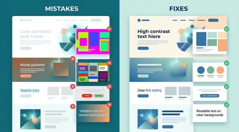
7 Color Theory Mistakes That Ruin Your Web Design (and How to Fix Them)

You have spent hours choosing the perfect palette. The blues feel calm, the orange adds energy. You publish the site, and something feels off. Text is hard to read. Buttons blend into the background. …

Read more
5 Steps to Designing Color-Accessible Web Interfaces
Color Theory
10 June 2026 noah

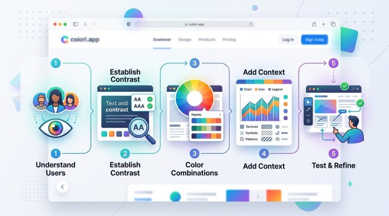
5 Steps to Designing Color-Accessible Web Interfaces

You already know that color makes a website feel alive. But consider this: for about 1 in 12 men and 1 in 200 women worldwide, red and green look almost identical. For someone with low vision, light g…

Read more
  • ← Previous
  • Next →

Recent Posts

  • Why Your UI Needs a Dominant Red to Trigger Action (and When to Hold Back)
  • 7 Quick Fixes for a Color Palette That Feels Too Cold or Too Warm
  • How to Build Brand Color Palettes That Work on Screens and Walls
  • Can You Use Neon Colors Without Breaking Your UI?
  • What Is Simultaneous Contrast and How Does It Affect Your UI Designs?

Archives

  • October 2026
  • September 2026
  • July 2026
  • June 2026
  • May 2026
  • April 2026

Categories List

  • Color Palettes
  • Color Theory
  • Design Tools
  • UI Design
  • UX Tips
  • Web Design