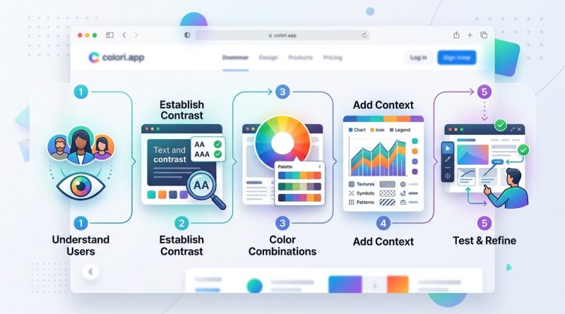
5 Steps to Designing Color-Accessible Web Interfaces
You already know that color makes a website feel alive. But consider this: for about 1 in 12 men and 1 in 200 women worldwide, red and green look almost identical. For someone with low vision, light gray text on a white background might as well be invisible. Color accessibility is not an extra feature. It is a core part of usable web design. When you prioritize it from the start, everyone wins. Your interface becomes clearer, your brand feels more trustworthy, and you avoid leaving out millions of potential users. In this guide, we will walk through five concrete steps to make your color choices meet WCAG guidelines. No fluff. Just practical methods you can apply today.
Designing for color accessibility means ensuring text and interface elements have enough contrast, never relying on color alone to convey information, and testing with real tools. Follow the five steps outlined here: start with a contrast safe palette, use redundant cues, validate with automated checkers, simulate color blindness, and document your decisions. The result is a more inclusive, legally compliant, and user friendly interface.
Why Color Accessibility Matters More in 2026
In 2026, web accessibility is not just a best practice. Many organizations face legal requirements under the Americans with Disabilities Act (ADA) and Section 508. WCAG 2.2 is now widely adopted, and the update to WCAG 3.0 is on the horizon. Color contrast remains a central checkpoint. Yet many designers still treat accessibility as an afterthought. A beautiful palette can fail if it does not pass contrast ratios. A call to action button might be invisible to someone with deuteranopia. The good news? You do not need to sacrifice design quality. With the right process, you can create vibrant, on brand interfaces that work for everyone.
5 Steps to Designing Color Accessible Web Interfaces
Here is a practical process you can follow for every project. Each step builds on the last, so you do not have to backtrack.
1. Build a Contrast First Palette
Begin with contrast. Do not pick colors based on looks alone. Use the WCAG minimum ratio of 4.5:1 for normal text and 3:1 for large text (18px bold or 24px regular). Start by choosing your darkest and lightest neutrals. Then pick your primary brand color. Check its contrast against both white and dark backgrounds. If it fails, adjust the lightness or saturation rather than abandoning the hue.
A helpful trick: design in grayscale first. Map out all text, backgrounds, borders, and interactive elements using only shades of gray. Once the contrast works, add color on top. This forces you to separate content hierarchy from decorative hue.
2. Never Use Color Alone to Convey Meaning
Color should support meaning, not carry it alone. When you use color to indicate status (green for success, red for error), add an icon, a label, or an underline pattern. The same goes for data visualizations. Do not rely only on colored lines in a chart. Use dashed patterns or shapes. For links, underline them by default, not just on hover.
This step helps everyone, not just people with color vision deficiencies. Users with screen readers, users on monochrome displays, and even users on bright outdoor screens all benefit from redundant cues.
3. Validate Every Combination with Real Tools
Do not guess contrast. Use automated tools. The WebAIM Contrast Checker is a classic. The Colour Contrast Analyser (CCA) is another solid choice. You can also use browser extensions like the axe DevTools or the WAVE tool. Run these checks on every component: body text, placeholder text, disabled buttons, link hover states, and focus outlines.
Make it a habit to test during design, not after development. Many design tools now have built in contrast checkers. Figma plugins like Able or Stark let you test directly inside your mockups. Use them.
4. Simulate Color Vision Deficiency During Design
Color blindness affects about 8% of men and 0.5% of women. The most common forms are deuteranopia (green red) and protanopia (red green). There is also tritanopia (blue yellow) and complete achromatopsia (no color at all). You can simulate these conditions in design tools. Figma has plugins like Color Blind or Sim Daltonism.
When you look at your design through a simulation filter, you may discover that two elements that looked distinct now merge. For example, a red required asterisk next to a green checkmark becomes invisible. Adjust by adding shapes or text.
5. Document Your Color System with Accessibility Annotations
A color system is only useful if your team follows it. Create a reference that lists every color role, its hex value, its contrast ratio against each intended background, and its pass/fail status for WCAG AA. Also note which colors are used for which purposes. For example, your error red might only work on a white background, not on a dark one. Write that down.
Include a note about color naming. Instead of calling a color “red” or “green”, name it after its function: “danger”, “success”, “neutral border”. This reduces confusion when developers implement the system.
Common Mistakes to Avoid
Even experienced designers slip up here. Watch out for these pitfalls.
- Using pure black (#000) on pure white (#fff). That seems high contrast, but it causes eye strain for many readers. A very dark gray on off white is more comfortable.
- Forgetting focus indicators. Keyboard users rely on visible outlines. If your focus style is a subtle color shift that does not meet 3:1 contrast against the background, it is useless.
- Designing disabled states with only reduced opacity. Disabled buttons often drop to 50% opacity. That new color may not meet contrast with background. Use a solid color that looks disabled but still passes.
- Developing a color palette on screen but never testing on a projector or mobile screen. Environmental lighting changes perceived contrast.
Best Practices vs. Common Mistakes
The table below shows where good intentions can go wrong.
| Best Practice | Common Mistake | Why It Matters |
|---|---|---|
| Use a contrast ratio tool during design | Rely on your eye to judge contrast | Human vision adapts; tools give objective numbers |
| Add an underline or icon to all links | Use color only to indicate link state | Users with color blindness miss the cue |
| Test with color blindness simulation filters | Assume your design looks the same to everyone | Simulation reveals hidden blending |
| Set a minimum contrast for non text elements (e.g., 3:1 for UI components) | Only check text contrast | Buttons, borders, and graphs also need distinction |
| Document color roles in a design system | Hard code colors without context | Team members may accidentally reuse a problematic color |
Expert Advice on Building Accessible Color Palettes
“Color accessibility is not about making everything grey. It is about making informed choices. The most vibrant palettes can be accessible if you adjust lightness and saturation. Start with contrast, then add life.”
— David A. McDougall, Senior Accessibility Consultant
That quote cuts to the heart of the matter. Many designers think accessibility means boring. It does not. You can keep your brand’s personality. You just need to be smart about where you place color and how you combine it.
Tools and Resources for 2026
Here are some free and low cost tools to help you put these steps into practice.
- WebAIM Contrast Checker – Enter two hex values and get instant pass/fail for AA and AAA.
- Colour Contrast Analyser – Desktop app for Windows and macOS. Lets you pick colors from your screen.
- Stark Plugin (Figma, Sketch, Adobe XD) – Check contrast, simulate color blindness, and generate accessible color palettes.
- Able Plugin (Figma) – Similar to Stark with a focus on contrast.
- Sim Daltonism – A free Mac app that simulates color vision deficiency in real time across your whole screen.
- Colori.app – A modern color tool that helps you create and test accessible color schemes (the host of this guide).
Keep these tools open while you design. The five steps work best when you weave them into your daily workflow.
Putting Accessible Color into Practice
You now have a clear path. Start your next project by picking a dark and a light neutral that pass 4.5:1. Add your brand color and check it against both. Then design with meaning beyond hue. Use icons, underlines, and patterns. Test every combination with a real tool. Simulate color blindness. Write it all down. The first time you do this, it might feel like extra effort. But after a few projects, it becomes second nature.
Accessible color is not a constraint. It is a framework that makes your work stronger. When you design for the edges, the center benefits. Your interfaces will be more readable, your users more satisfied, and your compliance more robust. Give these five steps a try on your next wireframe. Your audience will thank you. And if you want to deepen your understanding, check out our guide on mastering color harmony for web design projects or essential color theory principles every UI designer should know. Happy designing.