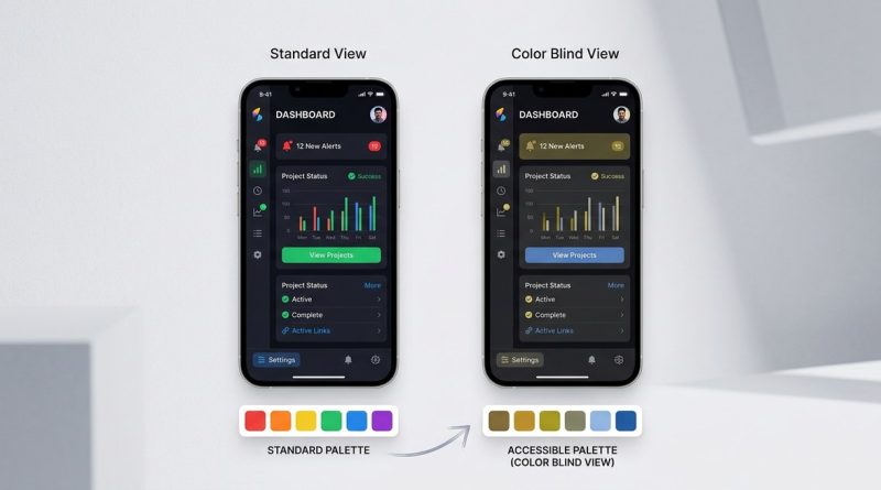
Why Color Blindness Should Shape Your Next UI Palette
Designing for the 8% of men and 0.5% of women with some form of color vision deficiency is not about making your interface ugly. It is about making it work. When you rely on color alone to convey meaning, you shut out millions of users. The good news is that building a palette that respects color blindness does not limit your creativity. It forces you to be clearer, more intentional, and ultimately a better designer.
Color blindness UI design is about redundancy, not restriction. Use text labels, icons, and patterns alongside color. Simulate your designs with color blindness filters. Test contrast ratios early. Focus on luminance contrast over hue contrast. When you design for color accessibility, you create interfaces that are clearer for everyone, not just users with color vision deficiency.
Why Color Blindness Changes Everything About Your Palette
Most designers think about color in terms of harmony, mood, and brand identity. Those are important. But if your primary way of communicating information is through color, you have a problem.
Red and green are the most common trouble spots. About 6% of men have red-green color blindness. That means error states, success messages, and status indicators built around red and green are invisible to a significant chunk of your audience. The same goes for blue-yellow deficiencies, though they are rarer.
Think about the last dashboard you designed. Did you use green for “active” and red for “inactive”? If you did, you created a barrier. A user with deuteranopia (green blindness) sees both states as similar shades of brown. The interface becomes a guessing game.
The fix is not to ban red and green. The fix is to never use color as the only differentiator.
The Three Types of Color Blindness You Need to Know
Not all color blindness is the same. Understanding the main types helps you anticipate where your palette will fail.
| Type | What Users See | Common Problem Areas |
|---|---|---|
| Deuteranopia (green blind) | Greens appear muted or brownish. Red-green distinction is lost. | Traffic light indicators, success/error states, data charts |
| Protanopia (red blind) | Reds appear darker, often black or brown. Red-green distinction is lost. | Warning badges, link underlines, required field markers |
| Tritanopia (blue-yellow blind) | Blues and greens look similar. Yellows appear pink or gray. | Blue links on dark backgrounds, yellow highlights, calendar events |
Each type requires a slightly different approach, but the core principle stays the same: add a second channel of information.
A Practical Process for Color Blindness UI Design
Follow these steps when building or auditing any interface.
-
Simulate first, design second. Before you finalize a color, run it through a color blindness simulator. Tools like Color Oracle or built-in browser dev tools show you exactly what your design looks like to different users. Do this before you hand off to development.
-
Add text labels to every color-coded element. If a badge says “Active” and turns green, that is fine. If it only turns green, that is a failure. Labels, icons, and patterns give context that color alone cannot provide.
-
Check luminance contrast, not just hue contrast. Two colors can look completely different to a normal viewer but identical to someone with color blindness. What saves you is brightness difference. Use a contrast checker that measures luminance. Aim for a ratio of at least 3:1 for non-text elements and 4.5:1 for body text.
-
Test with grayscale. Convert your entire interface to grayscale. If you can still understand the hierarchy, statuses, and actions, your design passes the most basic accessibility test. If something disappears, you are relying too much on color.
-
Get feedback from real users. Simulators are great, but they are not perfect. If you can, run a usability test with participants who have color vision deficiency. They will spot issues you never thought of.
Common Mistakes and How to Fix Them
Even experienced teams make these errors. Here is what to watch for.
| Mistake | Why It Fails | The Fix |
|---|---|---|
| Using red and green for status indicators | Both colors look similar to red-green blind users | Add an icon or text label alongside the color |
| Low contrast between background and text | Color blind users lose the text entirely | Check luminance contrast ratio with a tool |
| Color-only form validation | Users cannot tell which fields are wrong | Add error icons, helper text, and border patterns |
| Blue and purple link colors | Tritanopia makes blue and purple hard to separate | Underline links or use bold weight as a secondary cue |
| Chart legends that rely on hue | Lines or bars become indistinguishable | Use dashed lines, different shapes, or direct labels |
“Accessibility is not a feature. It is a design constraint that makes the product better for everyone.” This mindset shift is what separates teams who treat color blindness as an afterthought from teams who build inclusive products from the start.
Tools and Resources That Make This Easier
You do not need to memorize color blindness types or do complex math. Use these resources.
- Color Oracle (free desktop app) applies a color blindness filter to your entire screen in real time.
- WebAIM Contrast Checker gives you pass/fail results for WCAG compliance.
- Stark (Figma and Sketch plugin) lets you simulate vision types and check contrast inside your design tool.
- Colorblindly (browser extension) simulates color blindness on any website during testing.
For a deeper understanding of how color relationships work, check out our guide on It covers the fundamentals that make accessible palettes possible.
What a Color Blindness Friendly Palette Looks Like
Here are the characteristics of a palette that works for most users.
- High luminance contrast. Light colors sit next to dark colors. The difference is obvious even when hue is lost.
- Redundant encoding. Color is never the only signal. Icons, patterns, text, and weight all carry meaning.
- Avoids problematic pairs. Red-green, green-brown, blue-purple, and green-blue are used with extreme caution.
- Uses texture and shape. Charts and graphs rely on dotted lines, striped fills, and different marker shapes instead of just color.
A great example is a traffic light system. Instead of only using red, yellow, and green circles, add a cross icon for stop, a triangle for caution, and a checkmark for go. Now the meaning survives any color deficiency.
Why Contrast Ratios Are Your Best Friend
Many designers focus on hue contrast (red vs. green) when they should focus on luminance contrast (light vs. dark). Luminance is the perceived brightness of a color. Two colors with different luminance values will always be distinguishable, even if the viewer cannot tell what the hues are.
For example, a bright green button on a white background might look fine to you. But to someone with deuteranopia, the green turns into a muddy brown that barely stands out against the white. If you darken that green or add a dark border, the luminance difference increases and the button becomes visible again.
Learn more about how to apply this principle in our article on It explains the math behind the ratios and how to use them in real projects.
Designing for Color Blindness Improves Everything
Here is the part that surprises most designers. When you optimize for color blindness, your design gets better for everyone.
- Clearer labels help users who are scanning quickly or multitasking.
- Higher contrast makes text more readable on mobile screens in bright sunlight.
- Icons and patterns aid comprehension for non-native speakers.
- Redundant signals reduce cognitive load for all users.
What starts as an accessibility requirement ends up as a usability improvement. The same way curb cuts (ramps cut into sidewalks) help parents with strollers and delivery workers with carts, color blindness design helps power users, distracted users, and anyone with a screen that is not perfectly calibrated.
For more on building interfaces that work across the widest possible audience, read our piece on It connects color accessibility to broader inclusive design principles.
When You Should Break the Rules
There are rare cases where color alone is acceptable. If the color choice is purely decorative and carries no information, you have more freedom. A gradient background or an accent color on a button that already has a text label is fine.
But if the color communicates something, like a warning, a category, or a status, you must add a backup. That is the line. Decorative color is flexible. Informational color is not.
Start Small and Iterate
You do not need to redesign your entire product overnight. Start with the highest impact areas.
- Forms and validation messages
- Navigation and link styling
- Charts, graphs, and data visualizations
- Status indicators and badges
- Error and success notifications
Fix those first. Then expand to secondary screens. Over time, color blindness aware design becomes second nature.
For a step by step approach to building accessible color systems, see our guide on It walks you through the process from audit to implementation.
Make Your Next Palette Work for Everyone
Color blindness is not rare. It affects millions of users in the United States alone. When you design your next UI, treat color as one tool in a larger toolbox. Pair it with text, icons, patterns, and contrast. Simulate early. Test often.
The result is a product that feels more solid, more thoughtful, and more usable. Not just for the 8% who see color differently, but for every single person who lands on your screen. That is the kind of design worth building.