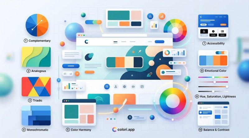
10 Color Theory Principles That Will Transform Your Web Design
Color can make or break a website. You have probably landed on a page that felt off for no clear reason. The layout was clean, the content was solid, but something felt wrong. Nine times out of ten, the culprit is color. Understanding how colors interact, guide the eye, and trigger emotions is not optional for a web designer anymore. It is a core skill. This guide walks through ten foundational principles of color theory for web design. Each one will help you create interfaces that look polished, feel intentional, and actually work for users.
Color theory web design is about more than picking pretty hues. You will learn how the color wheel creates order, why temperature sets the mood, how saturation affects depth, and why contrast drives usability. The 60-30-10 rule gives you structure. Color psychology connects to user behavior. Tints and shades add flexibility. By mastering these ten principles, you will build palettes that are both beautiful and functional. Apply them to every project for stronger, more accessible designs.
The color wheel is your design compass
Every color you see on a screen comes from three primary hues: red, blue, and yellow. Mix them and you get secondary colors like green, orange, and purple. Tertiary colors fill the gaps. This circular arrangement is the color wheel. It is the single most important tool for understanding relationships between colors.
When you need a scheme that feels natural, look to the wheel. Unlocking the power of complementary colors in web design shows you how opposite hues create high contrast and visual pop. Analogous colors (neighbors on the wheel) offer harmony. Triadic schemes bring balance with three evenly spaced colors. The wheel is your starting point.
Harmonic relationships make your palette sing
You can grab three random colors and call it a palette. It will likely look chaotic. Color harmonies are proven formulas that feel pleasing to the human eye. There are four main types you should know.
Complementary: Two colors opposite each other. High contrast. Great for calls to action.
Analogous: Three colors side by side. Calm and cohesive.
Triadic: Three colors evenly spaced. Vibrant but balanced.
Split-complementary: One base hue plus the two neighbors of its complement. Versatile and less aggressive.
“Using an analogous scheme for a meditation app feels tranquil. Switching to a split-complementary palette for a booking site gives you energy without the tension of straight complementary colors.” — Jenna Ruiz, UI lead at a design consultancy
You can go deeper with Why analogous colors create calming, cohesive interfaces and How to build a triadic color palette for high-impact web designs. Each harmonic type serves a different goal.
The 60-30-10 rule gives you proportions
A common mistake is using too many colors in equal amounts. The 60-30-10 rule solves that. It is a classic interior design principle that translates perfectly to UI.
- 60% dominant color. Usually a neutral or background hue. It sets the overall tone.
- 30% secondary color. Supports the dominant color. Often used for navigation, sidebars, or secondary buttons.
- 10% accent color. The attention grabber. Use it for primary buttons, links, and highlights.
This ratio creates hierarchy and prevents visual noise. For a detailed walkthrough, see How to use the 60-30-10 rule for balanced UI color schemes. Stick to the rule and your layouts will instantly feel more structured.
Temperature sets the emotional mood
Warm colors (reds, oranges, yellows) feel energetic, urgent, or cozy. Cool colors (blues, greens, purples) feel calm, professional, or distant. Temperature is one of the fastest ways to convey brand personality.
A fintech app might lean cool to inspire trust. A food delivery service might go warm to stimulate appetite. Mixing temperatures can work, but one should dominate. Why color temperature matters more than you think in web design explains how to balance warm and cool without clashing.
Saturation and value create depth
Saturation is the intensity of a color. A fully saturated red screams for attention. A desaturated red looks muted and serious. Value (also called lightness) refers to how light or dark a color is. Together, these two properties control the visual weight of every element.
Use high saturation sparingly for accents. Use low saturation for backgrounds and large areas. Vary the value to create a sense of depth: lighter values recede, darker values advance. This is how you build layers in a flat interface.
- For backgrounds: low saturation, high value (light, muted).
- For body text: very low saturation, very low value (dark and neutral).
- For buttons: medium to high saturation, medium value.
- For shadows: lower value than the surface color.
The designer’s guide to using saturation and value for depth has more specific techniques.
Contrast is king for usability
No principle matters more for accessibility than contrast. Text must be readable against its background. Buttons must stand out from surrounding elements. The Web Content Accessibility Guidelines (WCAG) define minimum contrast ratios.
| Element | Minimum ratio (AA) | Enhanced ratio (AAA) |
|---|---|---|
| Normal text (under 18px) | 4.5:1 | 7:1 |
| Large text (18px+ or 14px bold+) | 3:1 | 4.5:1 |
| UI components (focus indicators, icons) | 3:1 | 3:1 |
Check your palette against these numbers early. Tools like Color Contrast Analyser let you test in seconds. Why color contrast ratios matter for accessibility and aesthetics goes deeper into the math and the design trade-offs.
Color psychology drives behavior
Colors carry cultural and psychological associations. Blue signals trust. Red creates urgency. Green implies growth or health. Yellow evokes optimism. Black suggests luxury. These are not universal rules, but they are strong starting points.
When you choose a primary color, think about the emotional reaction you want. A medical site might use blue and white for cleanliness. A charity site might use green and earth tones for empathy. How to use color psychology to enhance user engagement in web design provides case studies and research.
But do not forget your audience. Color associations vary across cultures. Test your palette with real users whenever possible.
Tints, shades, and tones add flexibility
A monochromatic palette does not have to be boring. By adding white (tint), black (shade), or gray (tone) to a single hue, you create an entire family of colors. This is how you get multiple shades of blue for a professional UI without adding new hues.
Tints work well for backgrounds and hover states. Shades are great for borders and shadows. Tones make good secondary text colors. Using tints and shades ensures consistency because every color shares the same base hue. Are you overlooking the power of tints and shades in your color palette? covers this technique in depth.
Common mistakes to avoid
Even experienced designers fall into these traps. Here is a quick reference table.
| Mistake | Why it hurts | How to fix |
|---|---|---|
| Too many colors | No hierarchy, users feel overwhelmed | Limit to 3 hues; use tints and shades |
| Low contrast text | Hard to read, accessibility fails | Check ratios against WCAG AA |
| Pure black (#000) | Creates eye strain, unrealistic | Use a dark gray like #1a1a1a instead |
| Ignoring color blindness | Red-green combos become invisible | Use icons and patterns alongside color |
| Saturated backgrounds | Text is hard to read, fatiguing | Desaturate backgrounds; keep text high contrast |
7 color theory mistakes that ruin your web design has a full breakdown with before-and-after examples. Why you should stop using black in your UI designs explains the science behind the dark gray tip.
A practical process for building a palette
Theory is useful, but you need a repeatable workflow. Here is a step-by-step process that combines all ten principles.
- Choose a base hue that matches the brand personality and target emotion.
- Select a harmony scheme from the four main types (complementary, analogous, triadic, split-complementary).
- Apply the 60-30-10 rule to assign proportions.
- Adjust saturation and value for each color to create depth and hierarchy.
- Test contrast ratios for text and interactive elements.
- Add tints and shades for hover states, backgrounds, and borders.
- Review for color blindness using a simulator.
- Iterate based on user feedback and context.
Mastering color palette selection for stunning web designs walks through this process with a real project from start to finish.
Your next steps with color theory
You now have a solid foundation in color theory for web design. The color wheel gives you structure. Harmonies create relationships. The 60-30-10 rule keeps proportions balanced. Temperature sets the mood. Saturation and value build depth. Contrast ensures everyone can use your design. Psychology connects to behavior. Tints, shades, and tones expand your palette without chaos. And knowing common mistakes helps you avoid them.
Take one principle at a time. This week, audit an existing project using the 60-30-10 rule. Next week, check all your contrast ratios. Over time, these principles will become second nature. Your interfaces will look cleaner, feel more intuitive, and perform better. And that is what good color theory is all about.