Why Color Temperature Matters More Than You Think in Web Design
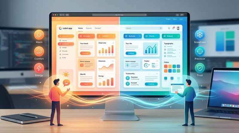
Color temperature is one of those design details that users feel but rarely articulate. You know the difference when you see it. A banking app with icy blues feels trustworthy but may come across as cold. A wellness site with soft amber tones feels cozy but could appear outdated. The Kelvin scale, which ranges from warm orange to cool blue, defines not just light bulbs but also every pixel on a screen. In 2026, with dark mode now standard and OLED displays producing deeper contrasts, getting color temperature right has become a subtle superpower for web designers. Ignore it, and your design might repel visitors without them knowing why.
Color temperature in web design directly influences user trust, readability, and emotional response. Warm tones (2700K-3000K) encourage intimacy and comfort, while cool tones (5000K-6500K) boost alertness and professionalism. Matching temperature to brand purpose and context, not just personal preference, improves conversion rates and reduces eye strain. Always test on calibrated screens across devices.
## What Color Temperature Means for Screens
In physics, color temperature measures the hue of light emitted by a theoretical black body when heated. Lower Kelvin values (around 2000K to 3000K) produce a reddish or yellowish glow. Higher values (5000K and above) shift toward blue and white. For web design, this translates directly into the digital palette you choose.
Screen white points are often calibrated to 6500K (D65), which matches natural daylight. But designers frequently deviate from that neutral baseline to set a mood. A landing page for a sleep app might use warm cream backgrounds (around 3000K equivalent) to signal relaxation. A productivity dashboard might stick with cool whites to mimic morning light. The key distinction is that on a monitor, color temperature applies to the overall chromatic bias of your interface elements, especially whites and near-whites.
## The Psychology of Warm and Cool in Digital Products
Human perception of color temperature is deeply tied to biological rhythms. Cool blue light suppresses melatonin and increases alertness. That is why many operating systems now include a night mode that shifts the screen to warmer tones after sunset. As a designer, you can harness this effect intentionally.
– **Warm palettes (orange, yellow, soft pink)** tend to feel approachable, optimistic, and safe. They work well for food delivery apps, children’s websites, or lifestyle blogs. However, too much warmth can make a site feel dated or muddy on low-quality displays.
– **Cool palettes (blue, teal, pure gray)** convey professionalism, cleanliness, and efficiency. They dominate banking, healthcare, and tech interfaces. But excessive coolness can feel sterile or unwelcoming, especially when paired with large areas of white.
The best results come from a balanced approach. For example, a SaaS documentation site could use a cool blue header to suggest reliability, then inject warm accent colors in call-to-action buttons to encourage clicks.
## Three Steps to Implement Color Temperature Intentionally
1. **Map your brand’s emotional goal to a Kelvin zone.**
Ask: Should this interface feel energetic or relaxing? For high-focus tasks like data entry, target cool neutral (5500K-6500K). For casual browsing or creative inspiration, aim for warm neutral (3500K-4500K). Write this target down and use it as a filter when selecting background tones.
2. **Check your white balance across devices.**
A color that looks like warm ivory on your MacBook may appear yellowish on a cheaper monitor. Use tools like browser color pickers to verify hex values under different display profiles. Keep your core backgrounds within a tight range of saturation to avoid unpredictable shifts.
3. **Use temperature contrast to guide the eye.**
Place warm elements (buttons, badges) against cool backgrounds to draw attention. Or reverse the strategy if your brand leans warm. The key is that the temperature difference, not just lightness difference, creates visual hierarchy. This technique is especially effective for accessibility because it works even for users with partial color blindness.
We cover more structured approaches in our guide on
## Common Mistakes and How to Fix Them
– Mistaking saturation for warmth. A bright red can be cool if it has a blue undertone. Always check hue.
– Using pure white (#FFFFFF) in a context that needs warmth. Swap it for a slightly warmer off-white like #FAF8F5.
– Ignoring ambient light where users view the site. An app used in bright sunlight may need a cooler palette to counter glare.
– Forgetting that dark mode reverses temperature expectations. Most dark mode designs use cooler tones for backgrounds, then warm accents for action items.
## Color Temperature Ranges and Their UI Effects
| Kelvin Range | Visual Feel | Best For | Watch Out For |
|————–|————-|———-|—————|
| 2700K – 3500K | Warm, amber | Reading apps, e-commerce, hospitality | Can appear yellow on uncalibrated screens |
| 3500K – 4500K | Neutral warm | News sites, blogs, forums | Needs careful pairing to avoid blandness |
| 4500K – 5500K | Neutral | Corporate, government, education | May lack personality without accents |
| 5500K – 6500K | Cool white | Productivity, finance, healthcare | Risks feeling cold if no warm accents used |
| 6500K+ | Blue-white | Gaming, high-tech, nighttime? | Can cause eyestrain; use sparingly |
## An Expert Perspective
> “Most designers obsess over hue and saturation but overlook temperature as a separate dimension. The most harmonious interfaces I have created started with choosing a white point for the background, then letting every other color relate to it. That one decision prevents the color palette from feeling random. It is the hidden anchor of visual consistency.”
> — M. Torres, Senior UX Designer at a Fintech Firm (2026)
## Why Color Temperature Matters for Accessibility and Readability
Temperature directly impacts legibility, especially for users with visual impairments or dyslexia. Warm light on a screen can reduce glare for some people, while cool light improves contrast for others. The WCAG guidelines do not explicitly mandate color temperature, but they do require sufficient contrast between text and background. A cool blue text on a warm white background may pass contrast checks but feel uncomfortable due to chromatic aberration. To avoid this, avoid pairing colors from opposite ends of the temperature spectrum unless they have enough luminance difference. For more on this intersection, see our piece on
## Pairing Color Temperature with Other Design Principles
Color temperature does not exist in isolation. It interacts with contrast, saturation, and layout. A high-contrast design with large headings can tolerate a wider temperature range. But a minimal interface with thin text demands tighter temperature control. If you are building a dark mode, the background should lean neutral cool (around 5000K) to avoid looking muddy. Accent colors can then be slightly warmer to feel vibrant. This logic also applies to photography and illustration overlays. For instance, adding a warm overlay filter to a hero image can make it feel nostalgic, while a cool overlay suggests professionalism.
## Putting Color Temperature to Work in Your Next Project
Start small. Choose one page or component and experiment with two versions: one with a warm background and one with a cool background. Ask a few colleagues which feels more trustworthy or energetic. You will likely notice that the response is immediate, even if people cannot name the reason. That is the power of color temperature in web design. It works beneath conscious awareness.
In 2026, users are more screen-savvy than ever. They have strong opinions about dark mode, blue light, and readability. By respecting color temperature, you show that you care about their comfort and experience. That care translates into longer visits, lower bounce rates, and a brand that feels intuitively right. Try it on your next redesign and see the difference for yourself.