How to Use the 60-30-10 Rule for Balanced UI Color Schemes
Designing a user interface that feels calm, intentional, and easy to navigate often comes down to one thing: color balance. Without a clear structure, even beautiful colors can clash or confuse. That is where the 60-30-10 rule comes in. It is a timeless interior design principle that works just as well for digital screens. By splitting your palette into three distinct roles, you can build interfaces that look polished without trying too hard.
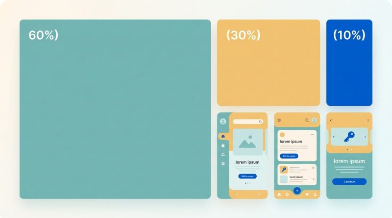
The 60-30-10 rule for UI color gives you a simple ratio to split your palette into a dominant background, a secondary supporting color, and an accent for actions. This structure creates natural visual hierarchy, reduces decision fatigue, and makes your design feel harmonious. Use it as a starting point for any interface.
What the 60-30-10 Rule Actually Means
The numbers stand for percentages of the visual area each color should cover. Sixty percent goes to your dominant color. This is usually a neutral or muted tone that acts as the background for most of the screen. Thirty percent is your secondary color. It supports the dominant one and often appears in navigation bars, side panels, or section headers. The final ten percent is your accent. This is a bold, high-contrast color reserved for interactive elements like buttons, links, or alerts.
Interior designers have used this ratio for decades to decorate rooms. In UI design, it works because the human eye naturally looks for a main area, a secondary zone, and then points of interest. When the proportions are off, the interface can feel chaotic or flat.
Why the Ratio Works for Digital Products
UI designers and web developers need a reliable way to create visual order. The 60-30-10 rule forces you to make deliberate choices. It prevents you from picking five or six colors that all compete for attention. By limiting your palette to three main roles, you get:
- Consistency. Users learn where to look for important elements.
- Focus. The accent color stands out because it is rare.
- Harmony. The dominant and secondary colors share enough visual weight to feel cohesive.
A well-known example is a modern dashboard. The background is white or light gray (60%), the sidebar uses a medium blue (30%), and the call to action buttons use a vibrant green or orange (10%). This combination feels both professional and approachable.
How to Apply the 60-30-10 Rule Step by Step
Follow this process to build your palette. You can adjust the exact shades later, but the structure stays the same.
-
Choose your dominant color (60%). Start with a neutral that works for your brand. White, off-white, light gray, or a very pale tint of your brand color. This color will cover backgrounds, containers, and large empty spaces.
-
Pick your secondary color (30%). This should be a color that pairs well with the dominant one. It often comes from your brand palette. Use it for headers, navigation bars, side panels, footers, and secondary buttons.
-
Select your accent color (10%). This is where you add contrast. It should be distinct from the other two. Use it for primary buttons, active links, error messages, or any element that needs user attention.
-
Test with wireframes. Apply the colors to a simple layout. Check that the accent does not get lost and that the secondary color does not overpower the dominant one.
-
Adjust for accessibility. Run your combinations through a contrast checker. Make sure text on the dominant and secondary backgrounds meets WCAG requirements.
After you have these three colors, you can add a few neutrals for text and borders. Black, dark gray, or white usually work. Keep them outside the 60-30-10 ratio because they function as typography and structure, not as part of the visual palette.
Common Mistakes and How to Fix Them
Even experienced designers slip up with the 60-30-10 rule. Here are three frequent errors and the solutions.
| Mistake | Why It Fails | How to Fix It |
|---|---|---|
| Using the accent color too much | The accent becomes common and loses its power. Users ignore calls to action. | Reserve the accent for one or two types of elements. Limit its use to around 10% of the screen area. |
| Choosing a dominant color that is too saturated | The background competes with the accent. The whole screen feels busy. | Pick a neutral or a very low saturation color for the 60% role. Save vibrancy for the accent. |
| Forgetting the secondary color’s role | The secondary color looks like a second accent, creating confusion. | The secondary color should support, not scream. Use it for larger areas like sidebars or banners. Keep its saturation moderate. |
Layer in Color Psychology for Better Results
The 60-30-10 rule only handles proportion. To make your design truly effective, you need to consider what each color communicates. Pair the rule with principles from color psychology.
- Trust and calm: Use blue as your dominant or secondary color. It works well for finance, healthcare, and productivity apps.
- Energy and action: Use red or orange as your accent. These colors grab attention for call to action buttons.
- Growth and nature: Green fits both secondary and accent roles. It feels fresh and reliable.
- Luxury and simplicity: Black and white with a gold accent creates a premium feel.
For a deeper understanding, check out our guide on using color psychology to enhance user engagement. It pairs perfectly with the 60-30-10 structure.
A Real World Example: From Sketch to Finished UI
Imagine you are building a task management app. Your brand uses a teal green and a warm coral.
- 60% dominant: Light gray (#F5F5F5) for the main background and card surfaces. This keeps the focus on content.
- 30% secondary: Teal green (#2A9D8F) for the sidebar, header, and section titles. It gives the app a cohesive identity.
- 10% accent: Coral (#E76F51) for the “Add Task” button, due date indicators, and active states.
The result is a clean interface where the coral button stands out immediately. Users never wonder where to click. The teal secondary color creates structure without fighting for attention.
If you want to experiment with different color roles, start by mastering color palette selection for stunning web designs. It will help you find shades that work within the ratio.
“The 60-30-10 rule is not a rigid law. It is a training wheel. Once you feel comfortable with the proportions, you can bend them to suit your specific layout. The goal is always clarity, not strict math.”
UI designer with 12 years of experience
Advanced Tips for When You Outgrow the Basics
Once you have used the rule on a few projects, try these refinements.
- Use the accent across multiple states. Keep the same hue but change its brightness for hover, active, and disabled states. This keeps the accent consistent while adding depth.
- Let the secondary color carry typography. White text on a dark secondary color works well for headers. It reinforces the hierarchy without needing another color.
- Test with dark mode. The 60-30-10 rule works in dark themes too. Swap the dominant to a very dark gray or black. The secondary and accent colors can stay the same, but you may need to adjust their saturation.
For more on accessibility, read our article on designing accessible UI color schemes for inclusivity and usability. It shows how to maintain contrast while following the rule.
Putting the 60-30-10 Rule to Work Today
The 60-30-10 rule for UI color is one of the quickest ways to go from a messy palette to a professional interface. It gives you a clear framework without stifling creativity. Start with a neutral dominant, a supportive secondary, and a punchy accent. Test it on a real layout. Adjust until the proportions feel right.
Your users will thank you when they can find the button, read the content, and enjoy the experience. That is the whole point of design.