7 Color Theory Mistakes That Ruin Your Web Design (and How to Fix Them)
You have spent hours choosing the perfect palette. The blues feel calm, the orange adds energy. You publish the site, and something feels off. Text is hard to read. Buttons blend into the background. Visitors leave within seconds. Color theory mistakes are the silent killers of good web design, and they are easier to make than you think. The good news? Every mistake has a simple fix. Let us walk through the seven color theory mistakes that ruin your web design and show you exactly how to correct them.
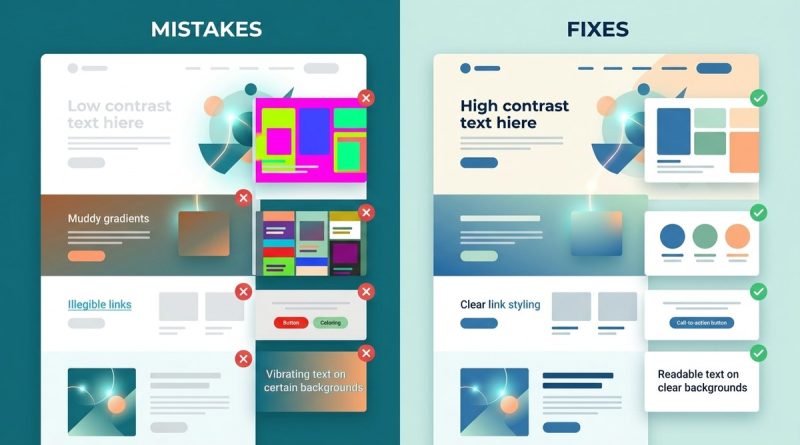
Color theory mistakes such as low contrast, overly complex palettes, and ignoring accessibility can tank usability and conversions. By applying techniques like the 60-30-10 rule, checking contrast ratios, and respecting color psychology, you can turn a confusing mess into a clean, trustworthy interface that keeps users engaged and happy.
Mistake 1: Low Contrast Text on Backgrounds
You found a beautiful pale blue and paired it with white text. It looks elegant on your monitor. On a phone screen in sunlight, those words disappear. Low contrast is the number one culprit behind poor readability.
Why it ruins the design
Users strain their eyes or simply leave. In 2026, people expect effortless scanning. If your body text has a contrast ratio below 4.5:1, you fail Web Content Accessibility Guidelines (WCAG) standards. Headlines should be at least 3:1.
How to fix it
Test every text color against its background using a contrast checker. Tools like WebAIM or your browser developer tools can measure the ratio. Use dark text on light backgrounds or light text on dark backgrounds, never midtones against midtones.
Common contrast mistakes
– Gray text on white (#999 on #fff is around 2.8:1)
– Yellow text on white (#ff0 on #fff is around 1.1:1)
– Blue links on black backgrounds (#00f on #000 is around 2.3:1)
For deeper guidance on contrast, see our guide on
Mistake 2: Overloading the Palette
You love all the colors. So you use eight of them across buttons, headers, borders, and backgrounds. The result? Visual chaos. Users cannot tell what is important.
Why it ruins the design
Too many colors create noise, not harmony. Every new color competes for attention, and nothing stands out. A cluttered palette also increases cognitive load, making users work harder to process the page.
How to fix it
Stick to one primary color, one secondary color, and one accent color. That is your core three. You can add one or two neutrals (like off-white or dark gray) for backgrounds and text, but that is it.
A simple process to build a clean palette
1. Choose a primary color that represents your brand.
2. Pick a secondary color that complements or contrasts well (use the color wheel for guidance).
3. Choose one accent color for calls to action.
4. Add two neutrals for backgrounds and text.
5. Remove any color that does not have a clear job.
If you need a refresher on color relationships, read about
Mistake 3: Ignoring Color Psychology
You designed a financial app using bright red as the main color. It feels urgent and alarming. Users interpret it as dangerous or untrustworthy. Color psychology is not a gimmick; it is rooted in how our brains respond to light wavelengths.
Why it ruins the design
Colors trigger emotional and behavioral reactions. Red increases heart rate and signals danger or excitement. Blue builds trust and calm. Green suggests growth or health. Using the wrong color for your message confuses visitors and hurts conversion.
How to fix it
Map your brand purpose to the color wheel. A wellness site benefits from soft greens and blues. A deadline-driven service (like project management) can use orange for urgency. Test your choices with real users or refer to established color psychology research.
Emotion cheat sheet
– Blue: trust, security, calm
– Green: nature, health, growth
– Red: urgency, passion, excitement
– Yellow: optimism, warmth, caution
– Purple: creativity, luxury, wisdom
– Orange: energy, confidence, friendliness
For a deeper look, see
Mistake 4: Forgetting Accessibility
You used green and red to indicate success and error. For one in twelve men with color vision deficiency, those two colors look identical. Accessibility is not just about contrast; it is about ensuring everyone can perceive your interface.
Why it ruins the design
Excluding a significant portion of your audience is both ethically wrong and bad for business. Legal requirements in many industries now mandate WCAG compliance. But beyond compliance, an inaccessible design frustrates users who then leave and never return.
How to fix it
– Do not rely on color alone to convey information. Add text labels, icons, or patterns.
– Check your palette with a color blindness simulator (many browser extensions exist).
– Ensure touch targets have sufficient contrast against surrounding elements.
Accessibility checklist
– All interactive elements pass 3:1 contrast with adjacent colors.
– Error messages use both color and text.
– Link states (hover, focus) have visible changes besides color.
– Grayscale test: can you still understand the interface without color?
Our article on https://colori.app/designing-accessible-ui-color-schemes-for-inclusivity-and-usability/ covers this in detail.
Mistake 5: Using Color as the Only Visual Cue
Your form shows required fields in red. But what if someone cannot see red? Or what if the page is printed in black and white? Information that depends solely on color leaves users behind.
Why it ruins the design
It creates barriers for people with color blindness, low vision, or anyone using a monochrome display. It also fails in edge cases like printing, screen readers, or high-contrast mode.
How to fix it
Layering multiple cues: color plus shape, text, or pattern. For instance, required fields can have an asterisk (*) and a red label. Success messages can use a green background and a checkmark icon. Error messages can use red and an exclamation mark.
Examples of redundant cues
– Links: underline + color change
– Buttons: icon + label + color
– Charts: texture or label + color
Learn more about inclusive design in
Mistake 6: Unbalanced Color Temperature
You mixed a warm red sidebar with a cool blue main area. The result feels disjointed, like two different websites glued together. Color temperature (warm vs. cool) affects visual harmony and hierarchy.
Why it ruins the design
Warm colors advance, cool colors recede. When used randomly, the eye jumps around without a clear path. Users feel unsettled and cannot focus on the content.
How to fix it
Pick a dominant temperature for your design. If your primary color is cool, use warm accents sparingly for calls to action. If your primary is warm, cool neutrals can balance it. Maintain a consistent temperature across sections to create a unified feel.
Temperature cheat sheet
– Warm: reds, oranges, yellows, browns
– Cool: blues, greens, purples, teals
– Neutral: whites, grays, blacks, beiges
For more on this topic, check
Mistake 7: Skipping the 60-30-10 Rule
You picked three colors and used them equally. Everything feels flat, like a wallpaper pattern. The 60-30-10 rule brings hierarchy: 60% dominant color, 30% secondary, 10% accent.
Why it ruins the design
Without a clear proportion, no element stands out. Important buttons get the same weight as backgrounds. Users cannot quickly identify what to click, read, or ignore.
How to fix it
Define your 60% color (usually a neutral for backgrounds). Use your 30% color (primary brand color) for headers and large areas. Reserve your 10% accent for buttons, links, and interactive elements. Adjust based on your brand, but maintain a clear imbalance.
Table: Mistakes vs. Fixes
| Mistake | Symptom | Quick Fix |
|---|---|---|
| Low contrast | Text is hard to read | Use contrast checker; aim for 4.5:1 body, 3:1 large text |
| Overloaded palette | Feels chaotic | Limit to 3 main colors + 2 neutrals |
| Ignoring psychology | Wrong emotion evoked | Match color meaning to brand purpose |
| Poor accessibility | Color-blind users confused | Add text/icons; simulate color blindness |
| Color-only cues | Missed information | Use redundant cues (icon + color) |
| Unbalanced temperature | Disjointed feel | Stick to one dominant temperature |
| No 60-30-10 rule | Flat hierarchy | Assign 60% background, 30% primary, 10% accent |
For a step-by-step application, see
Bring Your Color Choices into Focus
Color theory mistakes are not fatal. Every designer makes them at some point. The difference between a confusing site and a polished one is awareness and a few targeted corrections.
Start with one fix today. Use a contrast checker on your current homepage. Reduce your palette to three colors. Add a text label next to that red error indicator. These small changes compound into a design that feels professional, accessible, and trustworthy.
Remember that color is a tool, not decoration. When you treat it with respect for human perception and psychology, your web design will not only look better, it will work better for everyone who visits.