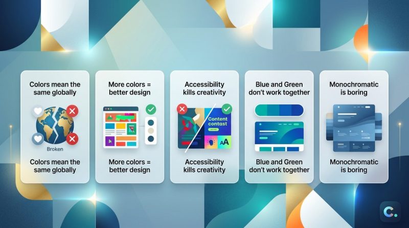
5 Common Color Theory Myths That Are Hurting Your Web Design
You have probably heard plenty of color rules. Use complementary colors for strong contrast. Stick to three colors maximum. Keep warm tones for call-to-action buttons. These rules get repeated in design forums, YouTube tutorials, and blog posts. But many of them are misleading. They can make your web projects look amateurish or even harm usability. It is time to separate fact from fiction.
Color theory myths in web design often lead to poor contrast, low readability, and confusing user experiences. This guide debunks five common misconceptions, from universal color psychology to the supposed necessity of complementary pairs. You will learn practical steps to test your palettes, understand context, and confidently break outdated rules. The result: cleaner interfaces, better engagement, and designs that truly serve your audience.
What Are Color Theory Myths and Why Do They Matter?
Color theory is a collection of guidelines, not laws. The human visual system is complex, and what works in a painting class may fail on a screen. When designers treat old art-school maxims as unbreakable rules, they create sites that feel off. Buttons get overlooked because the contrast is mathematically wrong. Emotional tone gets misread because cultural context was ignored. By understanding where the myths come from, you can make smarter decisions for every project.
Myth #1: Complementary Colors Always Deliver the Best Contrast
Red and green. Blue and orange. Purple and yellow. These pairs sit opposite each other on the color wheel, and many designers assume they guarantee high contrast. On paper, yes. On a screen, no.
The Reality
Complementary colors are mathematically opposite in hue, but their brightness and saturation often clash. A pure red and pure green placed side by side vibrate against each other. This effect, known as simultaneous contrast, can cause eye strain. Worse, it fails for colorblind users. About 8% of men have some form of color vision deficiency, and red-green confusion is the most common.
What to Do Instead
Focus on luminance contrast first. A dark blue text on a light yellow background may be complementary, but a dark gray on white often reads better. Use tools like WebAIM contrast checker to ensure your text meets WCAG ratios. Pair complementary hues only if you adjust their lightness and saturation carefully.
Table: Myth vs. Truth
| Common Myth | Truth for Web Design |
|---|---|
| Complementary always equals high contrast. | Luminance difference matters more than hue opposition. |
| Opposites attract and improve readability. | Many complementary pairs cause vibration and accessibility issues. |
| Colorblind users can still see complementary pairs. | Red-green and blue-yellow pairs are problematic for many users. |
Myth #2: Color Psychology Is Universal
Many articles claim blue means trust, red means urgency, and green means nature. This oversimplification leads to design failures across audiences.
The Reality
Color associations shift with culture, personal experience, and context. For example, white symbolizes purity in Western weddings but mourning in parts of East Asia. Red can signal luck in China and danger in other regions. Even within the same country, a teenage gamer may respond to neon purple differently than a middle-aged accountant. As designer and educator James D. Ellis once put it:
“Trying to apply a universal color emotion chart to web design is like using a crayon to fix a server. It looks good on the surface but does nothing for the actual problem.”
What to Do Instead
Research your specific audience. Run A/B tests on button colors. Use color primarily for hierarchy and consistency, not emotional shortcuts. If you want to build trust, focus on clean typography and fast load times rather than hoping a blue header does the work. For more on this, read our guide on using color psychology to enhance user engagement.
Myth #3: More Colors Equals More Exciting Design
Beginners often think a vibrant palette with five or six hues makes a site feel energetic. In reality, it overwhelms the user and dilutes brand identity.
The Reality
Human short-term memory can hold about four to seven visual chunks. When you bombard visitors with too many colors, they cannot remember which shade represents your brand or where to click. Studies from the Nielsen Norman Group show that users prefer simple, consistent color schemes. They also navigate faster on sites that use a limited palette.
The Bulletproof Limit
Here is a simple process to build a controlled palette:
- Choose one primary color for your brand.
- Pick one secondary color for accents (buttons, links).
- Add one neutral for backgrounds and body text.
- Optionally, include one highlight color for alerts or special calls-to-action.
That is three to four total. Stick to this set across every page. You can create variety by varying lightness and saturation (tints and shades) instead of adding new hues. Learn how to master color harmony to elevate your web design projects with a limited palette.
Signs You Are Using Too Many Colors
- You feel the need to add a rainbow just to separate sections.
- Your style guide contains more than six hex codes.
- Users often comment on how busy your site looks.
- You cannot describe your brand’s color scheme in one sentence.
Myth #4: The Color Wheel Is the Only Tool You Need
The classic color wheel from art class shows twelve hues and basic relationships. Many designers rely solely on it to pick schemes. But the wheel does not account for brightness, saturation, or screen gamma.
The Reality
A successful web palette depends on value (lightness) and saturation as much as hue. Two adjacent analogous colors can look muddy if their values are too similar. A triad of hues from the wheel might work in print but appear dull on OLED screens. The wheel is a starting point, not a solution.
Practical Workflow
Follow these three steps to go beyond the wheel:
- Gather inspiration from real-world sources like photographs, nature, or well-designed existing sites.
- Extract colors using a tool like Adobe Color or Coolors. Adjust hue, saturation, and lightness individually.
- Test on actual screens with realistic content and lighting. An hour of testing on mobile, tablet, and desktop beats hours of wheel-spinning.
For a deeper guide, check out our essential color theory principles every UI designer should know.
Myth #5: You Must Always Follow the 60-30-10 Rule Exactly
The 60-30-10 rule suggests using one color for 60% of the space (dominant), a second for 30% (secondary), and a third for 10% (accent). It is a great starting point, but many designers treat it as law.
The Reality
The rule works for simple, static compositions. Modern web pages include interactive elements, gradients, images, and videos that change the visual balance. A hero section with a full-bleed photo might break the 60-30-10 proportion entirely. Forcing the rule can make your design feel formulaic and rigid.
When to Bend the Rule
- Use the 60-30-10 structure as a reference for your core UI components (headers, sidebars, buttons).
- Let dynamic content override the proportions naturally. A product page with many images can use a much smaller dominant color area.
- Always prioritize contrast and legibility over strict ratios.
A Better Approach
Focus on creating a consistent system of color roles instead of fixed percentages. Define roles like:
- Background: Light neutral for body areas.
- Primary Text: Dark high-contrast for paragraphs.
- Interactive Elements: One accent color for links and buttons.
- Surfaces: Slightly different neutrals for cards, panels, and modals.
This system scales better than a rigid numeric rule. For more details, see our guide on how to use the 60-30-10 rule for balanced UI color schemes (with modern exceptions).
How to Test If You Are Falling for These Myths
Here is a checklist to audit your current design:
- Contrast check: Use a contrast ratio tool on all text/background pairs.
- Grayscale test: Convert your design to grayscale. Does the hierarchy still hold?
- Audience survey: Ask three people outside your team what emotions they associate with your colors.
- Colorblind simulation: Run your site through a simulator (like Stark or Chrome extensions). Are all interactive elements distinguishable?
- Screen variability: View your design on a cheap monitor, an OLED phone, and a bright office laptop.
If any of these tests reveal problems, you are likely relying on a myth.
What to Do Next: A Practical 3-Step Plan
- Audit your existing projects using the checklist above. Note which myths affect your work most often.
- Rebuild one small palette using the limited-color process (primary, secondary, neutral, optional highlight). Test it on a real page.
- Keep learning by exploring our top techniques for creating effective color schemes in UI design. Practice makes your intuition stronger than any rule.
Stop Letting Old Rules Limit Your Designs
Color theory myths in web design persist because they are easy to repeat. But every project is unique. Your audience, brand, and content deserve a thoughtful approach, not a cookie-cutter formula. Start questioning the rules you were taught. Test them. Break them when they fail. Your users will thank you with better engagement, lower bounce rates, and a design that actually works.
Now go take a hard look at your color palette. Adjust one element today. See the difference it makes.