Essential Color Theory Principles Every UI Designer Should Know
Creating an interface that captures attention and communicates clearly hinges on understanding how colors influence user perception. Whether you’re designing a website, app, or dashboard, applying core color theory principles can elevate your work from good to exceptional. This guide walks you through the essential concepts, practical steps, and common mistakes to avoid so you can craft interfaces that are both beautiful and functional.
Mastering color theory involves understanding hue, contrast, harmony, and context. Applying these principles thoughtfully helps create UI designs that are visually appealing, accessible, and effective at guiding user interactions.
What Are the Core Principles of Color Theory for UI Design?
Color theory is the foundation of effective visual communication. It explains how different colors interact, evoke emotions, and influence user behavior. For UI designers, understanding these principles ensures that every element on the screen guides the user effortlessly.
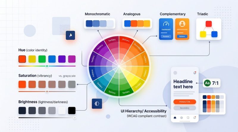
The Color Wheel and Its Significance
The color wheel is a circular diagram that organizes hues based on their relationships. It helps designers select harmonious color schemes and understand how colors work together. The primary colors—red, blue, and yellow—serve as the base, with secondary and tertiary colors created through mixing.
Key Concepts in Color Theory
- Hue: The color itself, like red or blue.
- Saturation: The intensity or purity of a hue.
- Value: How light or dark a color appears.
- Contrast: The difference between colors, vital for readability and focus.
Understanding these basics allows you to manipulate colors intentionally, creating a balanced and engaging interface.
How to Apply Color Harmony in UI Design
Color harmony refers to selecting colors that complement each other, resulting in pleasing aesthetics. Here are popular schemes to consider:
- Complementary colors: Opposite on the color wheel, like blue and orange. They create high contrast and vibrancy.
- Analogous colors: Next to each other, such as green, yellow-green, and yellow. They produce a harmonious, soothing effect.
- Triadic schemes: Three evenly spaced colors, like red, yellow, and blue. They offer balance and variety.
- Split-complementary: One base color plus the two colors adjacent to its complement. It provides contrast with less tension.
Using these schemes helps craft interfaces that are visually engaging without overwhelming users.
Practical Tip:
Choose a dominant color and build your palette around it. Use harmony schemes to select supporting hues that enhance usability and aesthetic appeal.
The Role of Contrast and Accessibility
Contrast determines how easily users can distinguish elements like text from backgrounds. For digital design, accessibility standards emphasize sufficient contrast to accommodate users with visual impairments.
Techniques for Effective Contrast
- Use tools like the Web Content Accessibility Guidelines (WCAG) to ensure your color choices meet minimum contrast ratios.
- Test your palette with online contrast checkers to verify readability.
- Remember that contrast isn’t just black and white. Subtle variations can make a big difference.
Common Mistakes to Avoid
| Mistake | Why it hurts | How to fix it |
|---|---|---|
| Low contrast between text and background | Hard to read, excludes users | Increase contrast or choose more distinct colors |
| Relying solely on color to convey information | Excludes color-blind users | Add icons or labels alongside color cues |
| Ignoring accessibility guidelines | Limits usability | Use contrast checkers and follow WCAG standards |
“Designing with accessibility in mind ensures your UI communicates clearly to everyone. Colors should enhance usability, not hinder it.” – Industry expert
Creating Effective Color Schemes for UI Projects
Developing a color palette is a critical step. Here are the steps to create an impactful scheme:
- Identify your brand or project personality: Is it energetic, calm, professional? Colors should reflect this.
- Select a primary color: This will be the main visual anchor.
- Choose supporting colors: Use harmony principles to pick secondary and accent hues.
- Test for contrast and accessibility: Ensure all users can interact comfortably.
- Apply consistently: Use your palette across all UI elements for coherence.
Practical process:
- Start with a mood board or inspiration images.
- Use online tools like Adobe Color or Coolors to generate palettes.
- Map your colors to different UI components—buttons, backgrounds, text.
- Gather feedback from users or peers for visual harmony and clarity.
Common Pitfalls in Color Choice and How to Avoid Them
Even seasoned designers can fall into traps. Here are typical mistakes and how to prevent them:
- Using too many colors, creating chaos rather than clarity.
- Ignoring cultural meanings of colors, which can lead to misunderstandings.
- Overlooking accessibility, resulting in poor usability.
- Relying on trendy colors without considering brand consistency.
Techniques versus mistakes table
| Technique | Mistake | How to improve |
|---|---|---|
| Use a limited, cohesive palette | Overuse of bright, clashing colors | Stick to 3-5 core hues and use neutral tones for balance |
| Test colors in different lighting | Ignoring how colors appear on screens | Preview your design on multiple devices and lighting conditions |
| Incorporate user feedback | Relying solely on personal preference | Gather input from diverse users early and often |
Bringing Color Into Your UI with Confidence
Applying color theory principles makes your designs more intuitive and engaging. Remember, colors are powerful tools that guide emotions, highlight actions, and communicate brand identity. Use the color wheel to craft palettes that resonate. Prioritize contrast for clarity and accessibility. Keep testing and refining your choices based on real-world feedback.
“Color is not just decoration. It’s a language that speaks directly to the user’s subconscious. Skillful use of color transforms a good interface into a great one.” – Color expert
Final Thoughts on Making Colors Work for Your UI
Colors can make or break a user experience. By understanding fundamental principles like harmony, contrast, and accessibility, you gain the ability to craft interfaces that are both beautiful and functional. Practice creating palettes, test them across devices, and always keep your users in mind. With a thoughtful approach, your designs will not only look good but also communicate effectively, building trust and engagement.
Now, grab your favorite design tool and start experimenting with colors that tell your brand’s story clearly and convincingly. Remember, great UI design is an ongoing process of learning and refining. Keep exploring the endless possibilities color offers.