How to Master Split-Complementary Color Schemes in 2026
In the world of color theory, some schemes feel like a secret handshake among designers. Split complementary colors offer that perfect balance: contrast without the jarring intensity of a direct complementary pair, and harmony without the boredom of an analogous scheme. Whether you are crafting a brand identity, designing a web interface, or picking paints for a mural, this scheme gives you room to play. Let’s break down what split complementary means, how to build one, and how to use it in your next project without second-guessing your choices.
Split complementary colors use one base hue and the two colors adjacent to its complement on the color wheel. This creates vibrant contrast with less tension than standard complementary pairs. Mastery comes from choosing a dominant color, applying the 60-30-10 rule, and adjusting saturation carefully. The result is a palette that feels bold yet cohesive, perfect for UI, branding, and illustration.
What Are Split Complementary Colors?
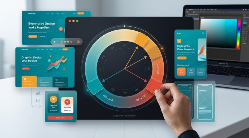
Split complementary colors sit right next to the direct complement of your base hue. Imagine you pick blue as your anchor. On the color wheel, the direct complement of blue is orange. Instead of using orange, you choose the two neighbors of orange: yellow-orange and red-orange. That trio (blue, yellow-orange, red-orange) forms a split complementary scheme.
The beauty of this setup is that it keeps strong contrast while reducing the shock that sometimes comes from a pure complementary pair. Your eyes get variety without the visual vibration that happens when two opposites fight for attention. This makes split complementary schemes approachable for beginners and reliable for pros.
You can think of it as a softer sibling to the classic complementary relationship. It gives you three distinct hues to work with, so you have more flexibility in creating depth and hierarchy.
Why Use a Split Complementary Scheme?
Designers turn to split complementary colors for several reasons:
- High contrast with less tension – The two flanking colors still contrast with the base, but they also share a bit of warmth or coolness with each other, creating a more comfortable visual experience.
- More color variety – Three colors give you richer opportunities for accents, gradients, and interactive states than a two-color scheme.
- Versatile across mediums – From web design to print to packaging, this scheme adapts well because you can adjust saturation and lightness to match the mood.
For example, a fitness app might use a deep teal as the base, with coral and gold as accents. The teal feels calm and trustworthy, while the coral brings energy and the gold adds a touch of warmth. That combination works without feeling like a clash.
If you want a deeper understanding of how contrast influences user experience, check out our guide on
How to Build Your Own Split Complementary Palette
Creating a split complementary palette is straightforward. Follow these steps:
- Choose your base color – Pick the hue that will dominate your design. This could be your brand’s primary color or the main background tone. Write down its angle on the color wheel (for example, 0° for red, 120° for green, 240° for blue).
- Find the direct complement – Add 180° to your base angle. For red (0°), the complement is 180° (cyan). For blue (240°), the complement is 60° (yellow).
- Select the two split colors – From the complement’s position, move 30° in each direction. So for a base of blue (240°), the complement is yellow (60°). The split colors are at 30° and 90° (yellow-orange and yellow-green). Some definitions use 22.5° or 30°; the exact angle can vary by tool. The important part is picking two neighbors that feel distinct.
- Tweak saturation and lightness – Rarely do you use pure hues at full saturation. Darken your base for backgrounds, lighten an accent for buttons, or desaturate one of the split colors to reduce competition. This step turns a theoretical palette into a usable one.
Once you have your three colors, you can extend the palette further by adding tints, shades, and tones of each hue. That gives you a full family of colors while keeping the split complementary relationship intact.
Applying the Scheme to Real Projects
Knowing the theory is one thing. Putting it into practice is where many designers stumble. The table below outlines common techniques and the mistakes that can undo them.
| Technique | Common Mistake | How to Fix It |
|---|---|---|
| Use one color as the dominant (60%), second as secondary (30%), third as accent (10%) | Treating all three colors equally, making the design feel chaotic | Assign clear roles: background, UI elements, and call-to-action buttons |
| Keep the split colors low saturation and the base high saturation | Using full saturation on all three, creating a muddy or garish look | Desaturate the two split colors by 20–30% relative to the base |
| Use the split colors for highlights and hover states | Relying only on the base and ignoring the split colors for interactive feedback | Test hover states on buttons using a tint of one split color |
| Combine with neutrals (white, gray, black) to balance | Adding too many neutrals that wash out the scheme | Limit neutrals to one or two, and keep them close to the base color’s temperature |
A good rule of thumb is to let one hue lead. That could be your base or one of the split colors, depending on the emotional goal. For a calming design, let the cool base dominate. For an energetic design, let a warm split color take center stage.
“The biggest mistake I see in student work is picking three exciting colors and then using them in equal amounts. Instead, assign a hierarchy. One color should be the star, one the supporting actor, and one the tiny but memorable cameo.” – Jamie Torres, color instructor at the Rhode Island School of Design
Common Pitfalls to Avoid
Even experienced designers can trip up with split complementary schemes. Here are the traps to watch for:
- Ignoring temperature – If your base is cool blue and both split colors are warm, that is fine. But if one split color skews too cool, it may look disconnected. Check that the split colors share a similar undertone.
- Overusing the split colors – Because they sit near the complement, they naturally draw the eye. Stick to using them for accents, not for large blocks of text or background.
- Forgetting accessibility – High contrast is great, but low contrast between the split colors and text can fail WCAG. Always check your palette against contrast ratios, especially for UI text.
- Choosing the wrong split width – A 30° split is standard, but you can vary it. Too wide (60° or more) and the scheme moves toward a tetradic feel. Too narrow (15°) and you lose the benefit of variety.
For a more comprehensive list of color missteps and how to sidestep them, read our article on
Tools to Help You Experiment
You do not need to calculate angles by hand. A few tools make building and testing split complementary palettes effortless:
- Colori.app – Our own tool lets you pick a base hue and instantly see the two split colors with sliders for saturation and brightness. You can export the palette as CSS, SVG, or a color list.
- Adobe Color – Use the color harmony rules dropdown to select “Split Complementary” and tweak from there.
- Coolors – Generate random palettes and lock specific hues, then adjust the harmony type to see split complementary variations.
- Paletton – Excellent for previewing how a split complementary scheme works in a sample layout.
When you are ready to apply your palette to a web project, the 60-30-10 rule becomes your best friend. Our guide on https://colori.app/how-to-use-the-60-30-10-rule-for-balanced-ui-color-schemes/ walks you through using proportions to create balanced interfaces.
Level Up Your Color Knowledge
Split complementary is just one stop on your color theory journey. If you want to strengthen your foundation, these resources will help:
- Learn how the color wheel itself works with
- Understand why color temperature (warm vs. cool) matters in
- For accessible designs, read
- Broaden your palette knowledge with
Start Designing with Confidence
Split complementary colors give you a flexible, forgiving entry point into color harmony. They offer just enough contrast to make your designs pop without the risk of visual fatigue. Next time you start a project, reach for this scheme as your default. Map out your base, find the two neighbors of its complement, and then let one color lead while the others support. Adjust the saturation until the palette feels right, then test it with your audience. You will quickly see why this scheme is a staple for designers building polished, professional work.
Go ahead and create something bold today. The colors are ready for you.