How to Use the Color Wheel to Build Cohesive UI Color Palettes
A color wheel is not just a relic from art school. It is a practical tool that helps you build a cohesive UI color palette, even if you are a developer who never took a design class. In 2026, digital products face more screen sizes, more accessibility standards, and more user expectations than ever. Your interface needs colors that feel intentional, not accidental. The color wheel gives you a repeatable way to achieve that.
Building a cohesive UI color palette starts with understanding the color wheel’s harmonies. Choose a dominant hue that matches your brand. Use complementary or analogous rules to pick supporting colors. Define your neutrals separately. Then scale every color into light, base, and dark tokens. Test contrast ratios and apply the palette consistently across screens. The wheel ensures every hue in your system has a clear relationship.
Why the Color Wheel Is Still Your Best Friend in 2026
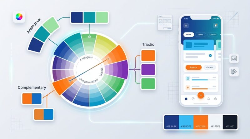
The color wheel organizes hues in a circular sequence. Red sits across from green. Blue faces orange. Yellow meets purple. These are complementary pairs, and they create strong contrast. Analogous colors sit next to each other, like blue, teal, and green, and they feel calm and harmonious. Triadic sets (three evenly spaced hues) give you balance without being boring.
For UI, you rarely use the wheel raw. You tweak saturation and lightness to make the palette work for backgrounds, buttons, text, and borders. The wheel is your starting point. It shows you which colors share a family and which ones clash. If you have ever struggled to choose a second color that does not look weird next to your primary, the wheel solves that.
When you build a cohesive UI color palette, every color should have a reason for being there. The wheel provides that reason. You are not guessing. You are following a system that has worked for centuries.
Mapping the Color Wheel to UI Tokens
A cohesive palette needs structure. You cannot just pick six random hex codes and call it a system. Modern design systems use color tokens: named variables that separate intent from value. The wheel helps you assign those tokens to harmonious families.
The table below shows how a typical UI palette maps to color wheel relationships. These examples start with a blue primary.
| Token group | Color wheel relationship | Example hues | Purpose |
|---|---|---|---|
| Primary | Dominant hue | Blue 600 | Brand color, main CTA |
| Secondary | Analogous or complementary | Teal or orange | Supporting actions |
| Accent | Complementary or split-complementary | Coral | Highlights, badges |
| Neutral | Desaturated near the wheel center | Grays, warm grays | Backgrounds, text |
| Success | Green (opposite red) | Green 500 | Positive states |
| Danger | Red (often near primary complement) | Red 600 | Error states |
| Info | Blue (same family as primary) | Blue 300 | Informational UI |
Notice that every token has a relationship drawn from the wheel. You are not throwing in a random purple because it looks nice in a palette generator. You are choosing a specific harmony, like analogous or complementary, and then applying it to a specific role.
A Practical 4-Step Process for a Cohesive UI Color Palette
Follow these steps to turn the color wheel into a real design system.
-
Pick one dominant hue from the wheel. This is your primary brand color. Choose a hue that reflects the personality you want. Blue for trust, green for growth, orange for energy. Stick to one. If you pick two primaries, you lose focus.
-
Use a harmony rule to find supporting colors. Open a color wheel tool. Set the mode to complementary or analogous. From your dominant hue, let the wheel suggest two or three additional hues. For a typical interface, one secondary color and one accent color is enough. More than that can overwhelm users.
-
Adjust saturation and lightness to create scale. Each hue needs a family of tokens: light (for backgrounds), base (for buttons and links), and dark (for text on light backgrounds). A good rule is to keep the base at around 60-70% saturation. The light variant should be very pale, and the dark variant should be almost black but still tinted with the hue. This ensures your palette stays cohesive even at different lightness levels.
-
Define a neutral palette that matches your hue’s temperature. Warm hues (red, orange, yellow) pair well with warm grays. Cool hues (blue, green, purple) work with cool grays. The neutrals are where most UI lives: backgrounds, cards, borders, body text. If your neutrals feel disconnected from your primary, the whole interface will look disjointed.
“Your color palette is a system, not a collection of favorites. Every color you add has a job to do. If a color does not serve a clear role, remove it.” — Jillian Amodio, product design lead at Tailwind Labs
Common Mistakes That Break Palette Cohesion
Even with the wheel, designers and developers slip up. Here are the most frequent errors.
- Using too many hues. Four is plenty. Five or six unrelated hues make the interface feel chaotic.
- Ignoring neutral colors. Grays are not off the hook. A gray that is slightly blue next to a warm primary will look muddy.
- Forgetting accessibility. A palette can be harmonious but still fail contrast checks. Always verify your light and dark pairs against WCAG 2.2 guidelines.
- Copying a stock palette without adjusting. The wheel can give you generic combinations. You must adjust the lightness and saturation to match your specific brand and components.
- Equating cohesion with sameness. A monochromatic palette is cohesive but can be boring. Use the wheel to add a complementary accent that provides contrast while still feeling connected.
- Not testing on real UI. A palette looks great in a grid of squares but falls apart on a live page. Prototype with real content before finalizing.
Real Example: How a Popular App Uses the Wheel
Think about Spotify. Their primary is a vivid green. That green sits on the color wheel directly opposite red. Spotify uses a complementary relationship: green for primary actions, and a muted red accent for limited notification badges. Their neutrals are deep grays with a slightly green tint. The result is a palette that feels both energetic and controlled. They do not use red everywhere. They keep the red accent rare. That restraint is what makes the palette cohesive.
When you apply the same thinking, you can build a system that works across dark mode, light mode, and every component in between.
Tools and Resources for 2026
You do not need to memorize the wheel. Several tools can automate the relationship mapping.
The colori.app color wheel tool lets you pick a base hue and see complementary, analogous, and triadic schemes instantly. It also generates lightness scales so you can go from background to text in one click. If you want to go deeper into theory, check out essential color theory principles that every UI designer should know.
For dealing with accessibility, read about designing accessible UI color schemes. It covers how to maintain contrast while keeping your palette harmonious.
And if you need inspiration for actual color pairs, the guide on top color combinations every web designer should know gives you tested combos derived from the wheel.
Your Palette Is a Living System
A cohesive UI color palette is not a one-time decision. As your product grows, you will need new tokens: hover states, disabled buttons, skeleton loaders, error toast backgrounds. Each new color must fit into the relationships you established with the wheel.
Do not treat the wheel as a strict rule. Treat it as a constraint that brings clarity. When you know why every color exists, you can make faster decisions and your users will feel the difference. Start with one hue, apply a harmony, scale it, and test it on real screens.
Your 2026 designs will thank you.